Launching a central design system in the Government of Canada: A Digital Service Network spotlight
This case study was originally published by the Digital Service Network in June 2025. Read the original version.
Background
Government websites play a crucial role in connecting the public with essential information and services. Consistent, reliable, and recognizable government websites are a key enabler of trust between the public and their government. With 30+ tools and systems for website and application development in place across the Government of Canada’s (GC) more than 100 departments and agencies, the Canadian Digital Service (CDS) highlighted a need for a more unified approach.
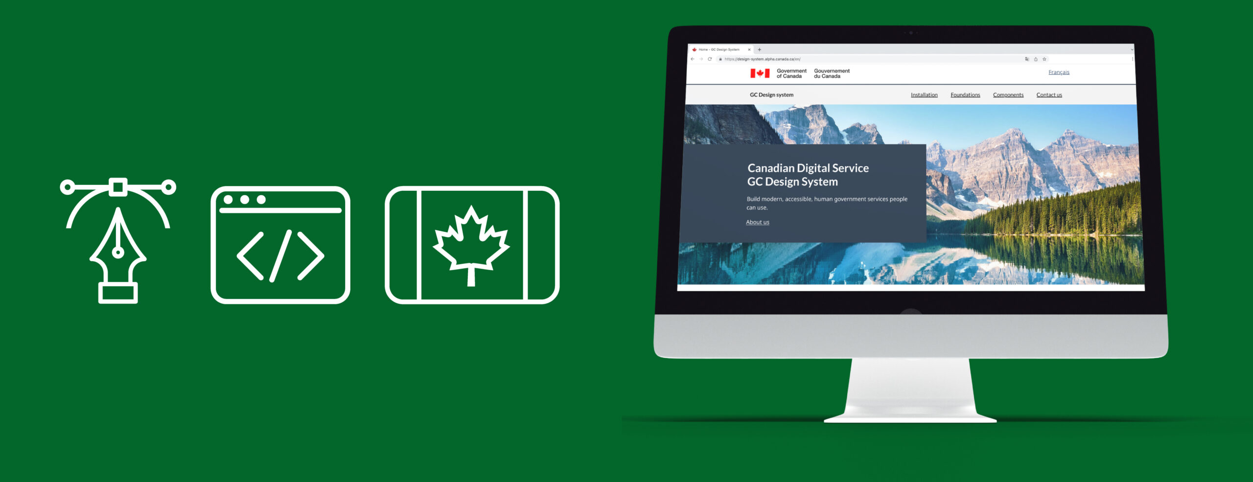
In response, the CDS introduced GC Design System. A design system is a “kit” for website and application developers and designers that includes a collection of tools, guidelines, and reusable components to create government websites and digital services, ensuring they look and function consistently. By adopting an in-house, centralized design system, the Government of Canada is simplifying the development of digital services, reducing redundancies, and creating a more cohesive user experience that inspires trust and confidence in government services.
To learn more, the Digital Service Network (DSN) spoke with CDS staff Melanie Boeckmann, a developer; Amy Morris, a content designer and Abdul Aminu, a product manager.
A need for centralization
Government websites in Canada and beyond have long struggled with scattered tools, outdated systems, and an absence of unified guidance and solutions for web application teams, making it difficult to build accessible and seamless online services. GC Design System set out to address these challenges. As content designer Morris explained, “The problem was that there was an over-saturation and decentralization of guidance, a lot of different rules, guidance, standards, and directives, but not in one place when you needed it.” This fragmented approach causes inefficiencies and leads to inconsistencies that undermine trust in government services.
One of the most telling examples of this problem was the inconsistency of the color “Canada Blue,” which, according to Morris, existed in “40 different versions.” Some used RGB codes, while others used hex codes, with no clear guidance on which to follow. This inconsistency made it challenging to maintain a coherent and recognizable government brand. To address this, GC Design System introduced design tokens to capture these design decisions in code, ensuring a consistent look and feel across all government websites.
Boeckmann, one of the team’s developers, framed these challenges as a branding problem, and recommended a comprehensive branding guide and a standardized onboarding process for designers and developers. Boeckmann noted that tools for digital website and service design were “scattered across different platforms,” making it hard for employees to quickly find reliable resources. A heavy reliance on third-party solutions compounded the issue by limiting teams’ abilities to update and modernize their existing design systems.
The vision for GC Design System was ultimately seeing efficiency as a gateway to prioritization. As Aminu, a product manager for GC Design System, explained, “GC Design System takes away the burden of effort, time, and resources from other government teams in creating and maintaining their own design systems.” These efficiencies enable teams to focus more on delivering services effectively and prioritizing improvements that have a direct impact on user experience. The system’s open-source approach also contributes to efficiency by allowing teams to adapt and build on existing components without starting from scratch.
GC Design System’s design pillars
GC Design System includes pre-made building blocks such as buttons, forms, and navigation menus, as well as comprehensive rules on colors, fonts, and spacing. By providing templates for common use cases like contact forms and basic pages, the system simplifies the implementation process while maintaining a cohesive government-wide style. Accessibility standards are also integrated from the start to ensure that these websites are easy to use for all Canadians, including those with disabilities.
Aminu outlined the structure of the platform around three pillars: guidance, design library, and code. This delivery framework ensures that every aspect of digital service design, from instructional content to actual code, follows a standard that prioritizes consistency and accessibility.
Pillar 1: Guidance
The first pillar of GC Design System is guidance, which serves as the instructional backbone of the platform. As Aminu explained, “This pillar is all about providing a lot of text and content, and whatever else is needed, that outlines for people how to do things right.” This includes rules and guidelines on how various design elements should look and behave. For example, there are detailed explanations on how to use colors, fonts, and spacing effectively to maintain a uniform look and feel. Boeckmann further describes this pillar as “having the rules built in.”
Pillar 2: Design library
The second pillar is the design library, which consists of pre-built interface components, including various buttons, forms, and navigation elements. The design library offers a rich prototyping platform in Figma mirroring the components, templates and styling variables that are offered in code.
At the core of the design library are design tokens, which Boeckmann describes as “little pieces of the design that are broken down into individual decisions.” These tokens store variables for colors, typography, and spacing, acting as a “source of truth” for website components. GC Design System also uses different layers of design tokens: base tokens for fundamental design decisions and global tokens to add semantic meaning and support brand identity. This layered approach allows for flexibility while maintaining consistency.
Pillar 3: Code
The final pillar of the GC Design System is the code itself, which is open source. “It’s open source. People can see it. People can contribute to it,” Aminu said. The GC Design System invites contributions from the broader developer community to promote continuous improvement. To function in the decentralized landscape of the Canadian federal government, the system supports and maintains a variety of front-end frameworks including commonly used modern Javascript frameworks, HTML, and packages for server-side rendering.
Building a cross-functional delivery team
The development of GC Design System was a collaborative effort that brought together a diverse range of expertise, from developers and designers to policy experts and content writers. This cross-functional, multidisciplinary approach enables the team to align on a unified vision and effectively tackle the twin challenges of decentralization and inconsistency.
Aminu stressed the importance of the diverse team: “We have developers, we have designers, we have researchers, we have content writers, we have project managers. We wouldn’t be as successful without these perspectives in the room. In particular, it would not have been possible without the Digital Transformation Office and policy people who help us translate complex regulations into practical design guidelines.”
Accessibility & flexibility
Accessibility and bilingualism are core principles of GC Design System. As Morris explained, “The goal is to ensure an equitable service in French and English by using plain language and clear, repeatable content that can be easily understood by those who speak either language.” GC Design system also complies with Web Content Accessibility Guidelines (WCAG), ensuring that components are accessible to Canadians with disabilities.
From accessibility checks to real-world usability tests, GC Design System is continuously refined. The GC Design System team works with both the Accessibility, Accommodation, and Adaptive Computer Technology (AAACT) team, an internal GC team that specializes in ensuring digital services are supporting all Canadians, and an external vendor that specializes in accessibility testing to uncover gaps in how components are perceived and used by people with disabilities.
The team also developed a “sandbox” site that showcases components in action and serves as a realistic space to test against accessibility standards. The sandbox site bridges the gap between accessibility in theory and accessibility in practice. Boeckmann recalled one session with a visually-impaired person that shifted her perspective. When the individual heard the alternative text description for a “radio button,” Boeckmann said, “They didn’t know what a radio button looked like because they hadn’t seen one before and no one had ever described it to them.” She shared that witnessing this user’s experience moved the team and illustrated the impact of their design decisions on the public.
Aminu also shared that prioritizing GC Design System’s flexibility alongside accessibility is essential, enabling updates to ensure ongoing accessibility as standards change, or updated styles should branding decisions shift. “The system is centralized, so you only need to make a change in one place,” he explained. “You make the change in the design, you make the change in the guidance, you make the change in the code. And then that change propagates out to everyone.”
Lessons learned
Centralized digital tools help build trust in government by reducing administrative burden. GC Design System helps Canadians feel confident when interacting with government services. “Familiarity, predictability, and accessibility inspire people’s trust in government services,” Morris said. By unifying design resources and establishing consistent standards across all federal websites, the system creates a consistent and predictable user experience, thereby decreasing the psychological costs and cognitive load required to navigate government websites.
Centralized digital tools enable efficiencies for government and free up resources for other priorities. As a centrally-delivered and managed tool, GC Design System reduces the time, resources, and effort required for development teams to build usable and compliant digital services; and allows teams that have historically maintained their own design systems to redirect those resources toward other program and service priorities.
Cross-functional teams enable good design of government systems for the public and administrators. GC Design System’s collaborative, multidisciplinary approach ensures that a wide range of perspectives are considered in the system’s design and deployment. These kinds of teams are essential for digital tools and services in government that meet the needs of internal administrators, as well as those of the public.
Resources & examples
To see how this work was put into practice, explore the following resources and examples in the Digital Government Hub:
- GC Design System site
- Prototyping Library (GC Design System Figma)
- GCDS-Components Github Repository
- Accessibility Statement
- Roadmap
- Design Tokens
- Page Templates
- CDS blog: A path towards a unified design system
- CDS blog: Meet GC Design System’s new templates for Canada.ca web pages
- CDS blog: Integrating Canada.ca brand requirements into GC Design System