
“To address the need for a more modern way to fulfill the Canada.ca design requirements, CDS has been developing GC Design System. This product will provide a more predictable and accessible design system that can be used across a multitude of platforms. It provides code, design, and guidance in a single place. It will eventually replace the Canada.ca Design System, as well as GCWeb, serving as the starting point for GC teams building web experiences and applications.”
– Blog: A path toward a unified design system for the Government of Canada
My name’s Abdul Aminu and I’m the Product Manager for GC Design System . I joined this product team at a time when there was a need for someone to step in and guide the product towards a longer-term strategy, while navigating a complex change management process.
My role is to be a bridge between the public servants building the design system and those using it. I take this responsibility very seriously, I carry the trust of both parties and I owe it to them to ensure their needs are being met. That means I am constantly assessing things at a high level to ensure the product stays on track towards our most important goals.
Additionally, I help to ensure that whatever work is done on GC Design System is communicated to current and potential users, so they can leverage it and provide valuable feedback for future iterations. Each week brings something new and challenging to work through and I feel honoured to be involved.
In this blog, I share our work on the new page templates available on GC Design System.
New page templates: Getting your web content up faster
Page templates are pre-built pages that combine GC Design System components for common layouts. They’re fully responsive across devices, and their structure supports a predictable, recognizable, and accessible user experience.
As the name suggests, templates allow GC teams to start with a Canada.ca web page that already has standard mandatory elements in place. Core patterns (Header, Footer, Headings, Grid, Spacing, and Typography) are conveniently set up, so you only need to modify the content. The idea is to give you a solid starting point, instead of starting from scratch.
Depending on how complex your page is, using the basic page template can cut development time by more than half. This frees you up to focus on the user journey and the specific functionality of your service.
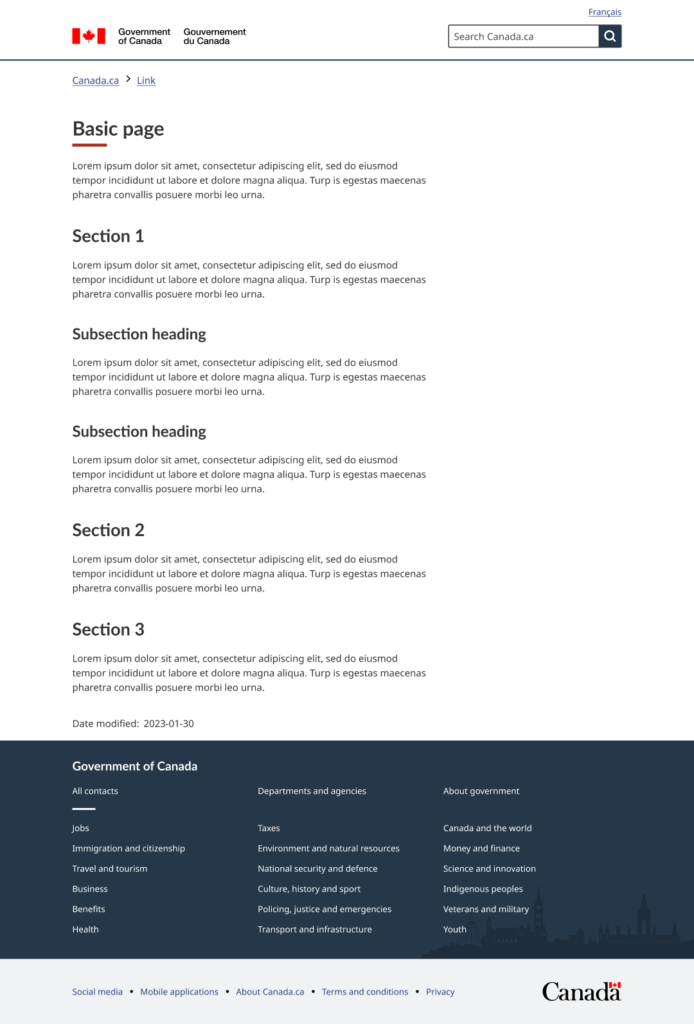
Caption: Screenshot of basic page template. Core patterns (Header, Footer, Headings, Grid, Spacing, and Typography) are conveniently set up, so you only need to modify the content.
Overcoming consistency challenges with page templates
We aim to provide every usable part of GC Design System in 3 main ways:
- Guidance on our website: Explains when and how to use components and templates.
- Code in GitHub: Offers fully coded versions of templates for teams to explore or integrate.
- Design files in Figma: Allows designers to directly copy and modify components and templates.
One major challenge was ensuring the page templates are created in a way that they can remain consistent across all three interfaces. That meant aligning terminology, design tokens, and overall presentation, so it feels seamless no matter where a team references (web guidance, code, or design in Figma). In the end, we overcame these challenges by systematically maintaining each version with a shared structure and clear documentation.
We also use the same design tokens across code and design, to ensure continuity, consistency and ease of maintenance. This means that all design decisions such as colour, typography, and spacing are defined in the GC Design System consistently.
Everything we produce is publicly accessible and open to feedback and collaboration. Our goal is to encourage the GC design and web community to contribute to the GC Design System, making it the best it can be.
Balancing accessibility, usability, and policy requirements
Each page template is built from GC Design System components and patterns that have already been thoroughly assessed for accessibility, usability, and compliance with GC policy. The page template is essentially the sum of these parts, and therefore, it benefits from all the research, testing, and assessments that have already been done. Of course, we still pay close attention to how we assemble them, but the beauty of “systems thinking” is that every piece is already tested and vetted.
It also helps that there’s a permanent, multidisciplinary core team dedicated to building and supporting GC Design System: policy experts, designers, developers, and researchers. We’re all aligned to create components, patterns, and templates that are accessible, usable, and policy-compliant. Everything we produce goes through rigorous testing, including external validation by users with different accessibility needs.
The Basic Page template includes: A clear heading hierarchy you can use to structure your content logically for everyone, including people using assistive technologies. GC Design System tokens meet level AA of the Web Content Accessibility Guidelines (WCAG 2.1) colour contrast standards for text and interactive elements and level AAA for both tap targets and visual presentation.
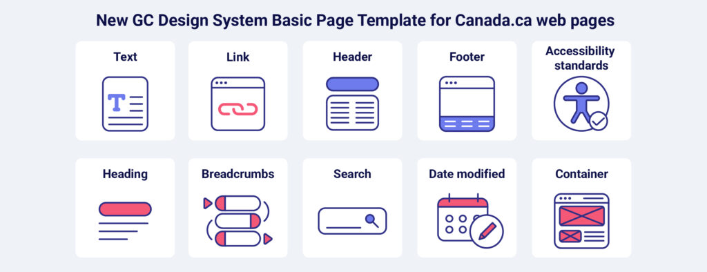
Caption: The Basic Page template is built using the following components that meet WCAG 2.1 AA accessibility standards: Text, link, header, footer, footer, accessibility standards, heading, breadcrumbs, search, date modified, and container.
Building off the work of the existing Canada.ca design system
Many of the core elements of the Canada.ca brand are already well established, and GC Design System uses this familiar look and feel as the baseline for everything we build.
GC Design System introduces a framework-agnostic approach so teams can seamlessly work with:
- HTML
- Angular
- Vue
- React
- Server-side rendering (SSR) applications
We always start from the Canada.ca design. If we spot any gaps or areas needing improvement, we build upon it thoughtfully in collaboration with the Canada.ca design team. There’s already extensive research and guidance available from Canada.ca, which was especially valuable in our early days as we implemented core mandatory components and patterns.
Occasionally, because of technological differences between the Canada.ca design system and GC Design System, we need to rework or approximate certain designs. But whenever we do, we stay as close as possible to the Canada.ca standards.
Get involved with GC Design System
The best way to get started is to visit the GC Design System website, test it, and share feedback.
- If you’re the type that prefers to dive right in, then check out the page templates code, design, and guidance as a starting point.
- If you prefer to see a demo first, feel free to sign up for an upcoming demo session, where you can get a good overview of what the product has to offer and if it can meet your needs.
We’re currently working on a few more page templates. We’re also exploring variations specifically for application development teams, which we’re calling “Starter Apps.” We’re close to releasing a Vue Starter App template, and we plan to have similar starter templates for Angular, React, and React SSR by the end of the 2025/2026 fiscal year. To see more on what is coming up, check out our roadmap.