At CDS, we’re constantly improving the accessibility of our products.
One of our tools is GC Notify: a product government teams use to send messages about processes like applying for a license, requesting/sharing information, and accessing benefits. Over 530 programs and services currently use GC Notify, like Health Canada for their recalls and safety alerts notification service (read interview).
We recently conducted accessibility testing and audits for GC Notify, so it was time to update the accessibility statement. This was an opportunity to revisit the statement’s role in our product. We want this content to clearly detail GC Notify’s accessibility, including compliance and limitations. By keeping the statement current, people can use it to find workarounds if they have trouble using GC Notify.
I’m the content designer on the GC Notify team. In this blog, I chat with my teammates about how plain language helped us prioritize accessibility improvements to GC Notify. We also share how we used back-to-back accessibility sprints to triage and fix issues, instead of adding to the backlog. Read on for resources and tips!
Plain language showed the impact
We looked to the COVID Alert app as inspiration for creating an easily understandable resource on accessibility issues that may impact users. You can learn more about how that app was designed in the blog Just enough detail: how we designed content for the COVID Alert app.
Other resources we reviewed:
- Developing an Accessibility Statement
- Generate an Accessibility Statement
- Accessibility at ESDC
- Accessibility Standards Canada’s accessibility statement
- GOV UK Notify Accessibility Statement
- Canadian Transportation Agency accessibility statement
- WCAG, but in language I can understand
- WCAG AAA in language I can understand
- WCAG 2.2 in language I can understand
To redesign our accessibility statement, we itemized known issues in an easily navigable table that links to the applicable criteria of the Web Content Accessibility Guidelines (WCAG). This helps users quickly check for problems they might encounter. The WCAG criteria provides context for the problem, clarifies what needs to be fixed, and suggests potential methods of repair.
We started by rewriting technical issues in plain language. For example, WCAG defines criterion 2.4.7 Focus Visible as “Any keyboard operable user interface has a mode of operation where the keyboard focus indicator is visible.” Our accessibility statement explains in plain language: “We should ensure you’re able to tell where the keyboard is on the page.” This allows users to easily understand if the issue affects them.
With a better understanding of these access barriers, we approached our Policy Advisor, Melissa Toutloff, about moving forward.
Creating equitable experiences
Chat with: Melissa Toutloff, GC Notify policy advisor
My colleagues are passionate about using GC Notify to create positive and equitable experiences. But technical accessibility language can hide the breadth of impacts on users. When written in plain language, we realized that public servants accessing GC Notify with assistive technologies may encounter multiple barriers.
The team and I agreed that fixing these issues needed to be prioritized. Public servants have a right to accessible tools – GC teams can’t provide inclusive services without them.
Adapting content to improve user experiences
Chat with: Marie-Sophie Bézert, Advisor, localization and linguistic services
As linguists, we craft content that makes every reader feel like it was written specifically for them. We’re committed to making people feel included, regardless of the language they use, how they identify, or the specific needs they have. You’ll find one example of our approach in my blog post Writing without excluding: Inclusivity in the French language.
We want people using assistive technologies to feel included in our services. It’s on us to design public services for people’s diverse needs. So when the GC Notify team needed to update the accessibility statement, we made changes with this in mind.
For example, one section on the issues table was titled “Various assistive technologies, including screen readers”. We changed it to “Compatibility with various assistive technologies, including screen readers.” This edit clarifies and emphasizes that assistive technologies are not the issue. Rather, we’re working to improve GC Notify’s compatibility with those technologies.
Building a better GC Notify
Always on the lookout: continuous scanning for accessibility issues
Input from: Andrew Leith, GC Notify developer
As developers, it’s easy to make common accessibility mistakes, even when we’re familiar with the rules and guidelines. Ensuring each user interface and interaction is usable and accessible, and meets WCAG criteria and other validation frameworks, requires a considerable team effort.
To reduce the time spent on manual testing, we’ve implemented continuous accessibility scanning using our UI test runner and the Axe accessibility testing engine. This setup provides a baseline of automated accessibility testing that occurs whenever we make changes to GC Notify, alerting us in real-time before any feature reaches our users.
During our back-to-back accessibility sprints, we used information from these scans to identify and fix issues, saving time and making GC Notify even more accessible. You can learn more about how our team develops GC Notify by checking out our GitHub repository.
Small but mighty fix: Buttons that work with voice technologies
Chat with: Phil Caron, GC Notify interaction designer
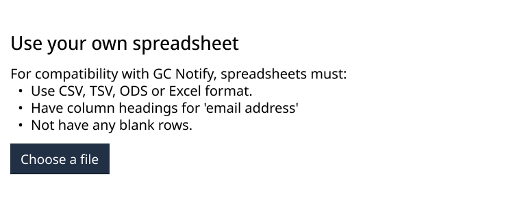
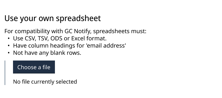
Accessibility testing showed that voice control technologies (such as Dragon NaturallySpeaking) experienced issues when uploading spreadsheets in GC Notify. This is due to the “Choose a file” interaction. Since we didn’t have access to the Dragon software, we weren’t aware of this issue prior to testing. That’s why testing with users and their preferred technologies is so important.
Before vs now
Before
This feature appears as stylized text with a blue background.
Sighted users could visually identify that there’s a button. But it did not work for users navigating by voice command, because their computers did not recognize the button.

Now
Users navigating by sight will not notice a difference between what the screen looked like “Before” and how it appears “Now”. But now voice technologies can identify the “Choose a file” feature and it functions as a button.
Our fix supports language accessibility and bilingualism standards. The button is customizable, making it easier to iterate in the future (check out our code).

Advice for GC teams!
Here are tips based on our accessibility sprint! Have questions about GC Notify or our accessibility work? Contact us.
Tips for running accessibility sprints!
- Design accessible products to remove friction and barriers for all users.
It’s not just about compliance, it’s about improving experiences. - Use plain language to understand human impacts.
Plain language makes the barriers clear, enabling their removal. This applies to accessibility statements, as well as other policy documents. - Seek management’s support for on-the-job accessibility learning.
You don’t need to be an expert to try to fix accessibility issues. Initially, the work can be uncomfortable and unfamiliar, but that’s how you’ll gain skills. - Collaborate to fix issues; cross-team input makes our product better.
We discussed trickier issues with other teams. For example, developer Peter Thiessen (GC Design System) held collaboration hours to brainstorm solutions based on his experience in the WCAG working group. - Improve work through content critique.
We’re grateful to all the content designers who helped improve GC Notify’s accessibility statement. Amy Morris (GC Design System) suggested the table format. Anik Brazeau (GC Forms) reminded us to front-load the most relevant information so readers can scan for issues that affect them. For example, our statement lets readers quickly find issues that affect “Firefox only”.