
A healthcare app that reminds us of a particularly difficult time is not always going to be a comfortable experience to build - or to use.
Our team at the Canadian Digital Service (CDS) strives to create services that are approachable to as many people as possible, knowing there’s more work to be done in building trust and improving how people interact with government services,
So when I was asked to illustrate for COVID Alert, a nationwide exposure notification application to help Canadians slow the spread of COVID-19, my ultimate goal was to create designs that included a full range of diversity in order to allow everyone to feel like they were included in the fight.
Working alongside the COVID Alert team, we wanted to be as transparent and inclusive as possible, as we embarked on the process of creating low-burdening, accessible and universal illustrations for the app. I had three main goals in mind with these illustrations:
- Create clear mobile-friendly concepts.
- Reflect diverse populations within Canada.
- Curate approachable and credible visuals in the app to promote the use of more visual storytelling in government services.
Create clear mobile-friendly concepts — collaboratively
I spent the first day working with the design team to get their feedback on the drawing style of the app. Collectively, we made the decision that the app’s “stroke weight” (which is the width of the drawing lines of the illustrations) needed to be thick enough to be able to display concepts on smaller screens, but still allow room for important details.
As I began the process of designing each screen, I would first show the team its concept (otherwise known as the visual idea and story behind a screen’s illustration) and allow for critique, before adding colour. This was important in gauging whether the concept connects to the message, or if it could be interpreted in other ways that lead to misunderstandings and unintended consequences.

While critique sometimes gets a bad rap, it was crucial to this design process, providing insight into how these illustrations could be seen and understood by those who would use the app. I never said no to reworking a rough draft of a concept because I relied on my team’s honest critique, which ultimately saved us a lot of time and iterations when the visuals later went through rounds of testing.
Reminder: Critique can provide opportunities for dialogue and genuine communication.
Reflect diverse populations within Canada — or at least try to
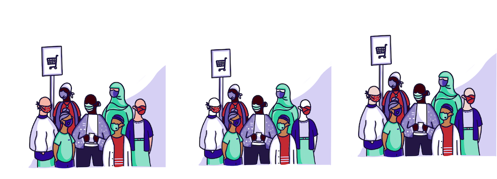
I knew that illustrating with diversity and inclusivity would be the most challenging part of the design process, requiring many attempts, and many methods of testing and iteration. Here are the areas where I wanted to start:
Showing diversity beyond hair
Hair is one of the most wonderfully diverse things about us, but it’s also one of the things that can have someone judge us very quickly.
I honestly did not feel prepared to properly capture the deep cultural, social and personal significance of hair in COVID Alert’s illustrations, so I pushed myself to show diversity in other ways, through clothing, items, movement, and accessories.
I also explored material for diversity in my own experiences and reflected that in the people and families we see traveling, shopping, playing, talking, commuting, walking, and skipping.

Use a minimal colour palette - but make it inclusive
In my previous experience designing visuals for health care products, using a small selection of colours won’t overwhelm people, but will still highlight the focal points of the contrasting colours.
For COVID Alert, our team went with a minimal colour combination in order to reduce confusion, allow the eye to adapt to each screen easily, and take into account all app users — including those with vision challenges.
In keeping with a minimal colour palette we used for the app, I still sought to reflect all the wonderful colours in Canada.
A lot of illustrations of people with minimal colour palettes pigment those with lighter skin, while using the same stroke colour (often purple, blue, or black) for people with darker skin. This lack of contrast leaves little detail for the eye to see against, bouncing your eye back to the people with higher contrast details (ie. those with lighter skin) - ultimately, making them the focal point of the illustrations.
I decided not to give lighter skin characters in the app pigmentation in order to give equal contrast and tone to all characters featured on a screen. In the following examples of side by side tests, you can see the difference that a small design choice makes in allowing characters with different skin tones to be seen and represented more equally, resulting in a more inclusive design.
 Reminder: You can show diversity beyond colour and hair.
Promote more visual storytelling in government services
When we don’t understand the intention of a service, this could lead to mistrust. While many people rely on government services, the consequences of not understanding or following the rules of a service transaction can lead to negative consequences and prevent them from meeting their goals.
Meanwhile, while some of us rely on the act of reading to ensure we follow instructions properly, a lot of people learn through visuals, and not language. To be inclusive, it’s helpful to use both.

COVID Alert was an opportunity to show how important user experience in visual design is. When we’re building services, we’re still trying to make our message and story as accessible as we possibly can to as many people, in and outside of Canada.
Reminder: A post it picture and a map can’t always tell the right story.
Visual storytelling is more than an aesthetic - it’s a core feature that can impact whether people see themselves in a service.
A big part of COVID Alert’s success is based on whether people understand and trust the service.
Of course, putting the app out into the world doesn’t mean the work is done - our visual concepts are continually being tested and iterated on. We welcome feedback about the app, and hope COVID Alert’s illustrations help capture Canada’s diversity of experiences.